
Chart of Housing Starts and 30-Year Fixed Mortgage Rate from July 1974 to July 2020

Monetary policy affects interest rates, which affect mortgages, which affect decisions in the housing market. The red line in the graph is the average 30-year fixed-rate mortgage (right axis) from July 1974 to July 2020. The blue line in the graph is the ratio of housing starts built by contractors over housing starts built by owners (left axis) for the same period.
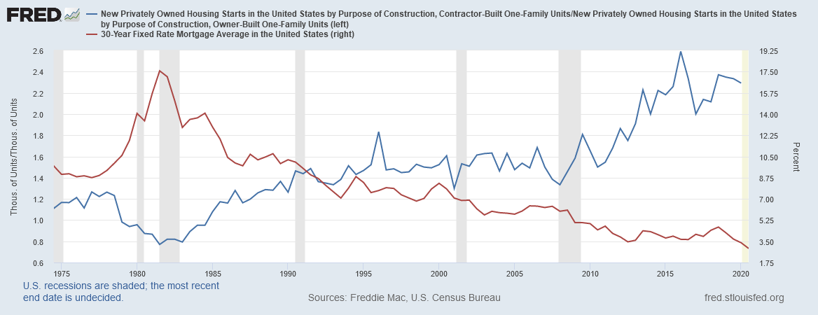
As one can see from the chart above, there is a direct correlation between housing starts and the 30-year fixed mortgage rate.