
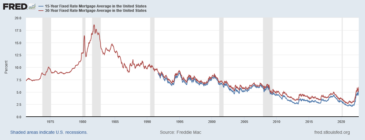
Chart of 15 and 30 Year Fixed Mortgage Averages in United States

The graph shows that mortgage rates for fixed-rate mortgages: the 15-year and 30-year. Every data point is the average rate offered at that point in time for new mortgages. It should be noted that the graph shows the most current rates, which few people with existing mortgages are actually paying. Homeowners that have existing mortgages have lower rates, than those currently getting mortgages.
As prices and especially wages increase, those with an existing fixed mortgages should find it easier to pay their mortgage debt in times of inflation versus those people that rent.
Please note this chart required the following Freddie Mac disclosure: Data is provided “as is,” with no warranties of any kind, express or implied, including, but not limited to, warranties of accuracy or implied warranties of merchantability or fitness for a particular purpose. Use of the data is at the user’s sole risk. In no event will Freddie Mac be liable for any damages arising out of or related to the data, including, but not limited to direct, indirect, incidental, special, consequential, or punitive damages, whether under a contract, tort, or any other theory of liability, even if Freddie Mac is aware of the possibility of such damages.
Please contact The Siburg Company anytime to discuss your business’s strategic plans.
The Siburg Company specializes in buy-side and sell-side mergers and acquisitions, and strategic planning consulting services.
Contact us at (480) 502-2800